Monday 22 October 2007

3rd Entry

The lecture started with a talk about our blogs, that some of us haven’t got enough words, haven’t ordered it properly or haven’t included links to additional reading. Some of those points relate to me (glad I’m not the only one!) so I’ll be sorting that out in the next few days.

We then focused on interfaces. We started looking at the interfaces of operating systems, looking at how they started with the command prompt to the start of graphical user interfaces and where they are today and windows compared to Linux and Mac OSX. The first computer I used was an Amiga 1200, which had a very good graphical user interface, but I still remember using the PCs command line to launch some applications.

We then moved onto the interface of websites. The first one we saw consisted of a blank page and a column of grey symbols with no description. I think the idea was to encourage users to find out themselves what has behind the symbols instead of finding out it was a subject they were not interested in and clicking off it straight away. Although I think only the most curious of users would have actually read what was behind the symbols but it was a good idea and very original. The second website we looked at was of a famous composer for the music in films, although I can’t remember his name! It was a website done in Flash. It used multimedia very well using graphics animation and animation to project a very dramatic website to the user. It had a feature where you could change the music which changed the whole atmosphere of the site. I never knew music could have such a dramatic effect, something I would definitely keep in mind for Flash applications and websites. The were some design flaws though, the website looked a bit cluttered with all the animation and made it less user friendly compared to a conventional design although all in all it was a good, innovative design. The final one was a religious website. It said something like “Jesus loves you”. It contained a flashing multicoloured background, lots of random animated graphics and strange audio. I couldn’t work out whether it was a joke or they were trying to be serious! It was multimedia overload, not the way to design a website!

After the websites we looked at what makes a good interface considering the use of colour, fonts and navigation. Colour is important to make the site interesting to read and not appear dull but you have to be careful that the colours don’t clash (like red and blue). You also have to keep in mind what colour blind people see and realise they don’t see the same things as people with regular vision. Fonts need to be carefully considered, especially with websites because if you use a font that is not loaded the users system, they will not be able to see it (unless it is contained in an image). You also have to make sure the font is too large or small, is the right colour and is at least readable. The navigation is very important. It needs to be clear, easy to access and uniform throughout the site. All this information learnt can be applied to many things from websites to applications. It is definitely something I will keep in mind for the future.

To finish the lecture we watched a video called “Fat Kid on a Rollercoaster”, the perfect way to end the last lesson of the week!

I found a good website at home explaining what makes a good website (link 1).

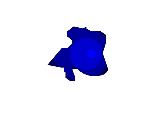
The tutorial was based around shape tweening. Shape tweening is very similar to implement to the motion tweening we did in the previous tutorial. Where motion tweening moves an object, shape tweening transforms an object. The only difference to applying a shape tween as opposed to a motion tween is that you select shape tween from the tween drop down box instead of motion tween.

I made a few animations that changed a circle into a square and the text ‘one’ to ‘two’ and back again. I did this by breaking the shape apart twice so that each pixel was animated separately creating a very smooth transaction. I played around with the blend and ease options to see how it would change my animation. I didn’t really see any difference with the different blend option but ease produced a noticeable change in speed during the animation. Ease seemed to make it look much more professional so I’ll definitely be using that feature.

I had a few more goes creating different shapes and seeing the patterns they make as they cross over each other. Sometimes the tween created won’t be what you had hoped for, like going from white straight to black when it is meant to be a smooth transaction. You can sometimes get around this by putting a small cut through the shape which changes the animation. This certainly helped with my animations although you can see the cut even if its just a one pixel line so I will probably only use this method as a last resort.

Finally we added some shape hints which gave us greater control over the animation of the shape. They worked by allowing you to choose what part of the shape or text gets animated and where it moves and gets transformed tool. Probably the most useful feature I learnt in the tutorial and one I will definitely be using again.

At home I had a read of a shape tween tutorial I found on W3C Schools, listed bellow.

  1. What makes a good website - http://www.barnard.edu/resnet/webpublishing/goodsite.html

  1. WC3 Schools shape tween tutorial http://www.w3schools.com/flash/flash_shapetween.asp


Tuesday 16 October 2007

2nd Entry

In the lecture we were shown a few blogs as examples. Its amazing to see how some blogs can get so large in regards the amount of hits they receive. Something I did notice was that the design of these large blogs weren’t really any different to the design of our blogs. This shows the content is so much more important the design and something that must be focused on a lot more, especially considering the interface most users would use is the one of the RSS reader. We were shown the RSS interface that would be used to view our blogs, once again showing us that design is not all that important (as long as it’s not blue text on a red background!)

We then moved on to using Adobe Flash. We were shown a basic flash animation on a fish moving up and down with its mouth moving in and out. We were also the interface of Flash and how to use motion tweens on the timeline. I used to have a copy of Flash MX2004 years ago when I first got into web design but despite owning a book on it, never really got then hang of it so to see how to do it in front of me was a really big help although you can’t really get to know the program unless you try it out for yourself. I’m lucky enough to have a copy of Flash CS3 installed on my laptop so I had a go at a few animations myself. I could get them to move on screen but the animation didn’t stay in the middle of the screen when I went to test movie, but it was still a good step forward in my understanding of flash.

We briefly touched on Action Script, something I had not been looking forward to! To be honest, Action Script was probably the biggest factor for me loosing interest in Flash and moving onto other web design languages when I first started out. I really hope Adobe’s first attempt of a new version of Action Script isn’t too bad!

At the end we were shown some storyboards on Pixar’s website. It was interesting to see the planning and the finished product displayed side by side, something you very rarely get to see. Understanding storyboarding may become useful if I ever have to create a Flash animation with lots of frames. The website was a very useful resource and something I would definitely go back to.

In the tutorial we had our first go in Flash applying what we learnt in the previous lecture and following a tutorial on Blackboard. We used the timeline to create keyframes and motion tweens to make an animation. I created two animations, some strange shape moving across a screen and a bouncing ball (links 1 & 2). I found the tutorial really helpful, it enabled me to get familiar with the interface and the basic features, something that would probably be very useful when we start using some of the more advanced features. I had a look at some other tutorials on the W3C Schools website (links 3 &4).

  1. Strange shape - http://i20.photobucket.com/albums/b250/iridiumcomputers/Strangeshape.gif
  1. Bouncy ball - http://i20.photobucket.com/albums/b250/iridiumcomputers/Ball.gif
  1. Flash tutorial 1 - http://www.w3schools.com/flash/flash_tweening.asp
  1. Flash tutorial 2 - http://www.w3schools.com/flash/flash_shapetween.asp

Monday 15 October 2007

1st Entry

My first lesson on internet application development was a tutorial on Friday the 5th of October. We all thought we were going to be told how to enrol on Blackboard (again!) and told to go away and turn up to the next lecture but pleasantly this was not the case! First we were told to find definition of a blog and find a blog on the internet and write a brief summary on it to get familiar with blogs. This was no problem for me since I visit a number of blogs on the internet.

We were also shown how to properly reference, something I found particularly useful since I hadn’t had been taught to reference before, the most I ever did was write a bibliography at the end of a piece of coursework. We were shown how Wikipedia may not be the most accurate resource by finding out what happened to Siegenthaler Senior, an American journalist who had inaccurate information written about him by a man who was trying to win a bet. The bad part is other websites took this about him from Wikipedia and published it on theirs creating a snowball effect. It was interesting because I had known information could potentially be inaccurate on Wikipedia but I didn’t know it had actually effected someone’s reputation. I will definitely be more careful when using Wikipedia to find information and would always use other websites and / or any other media to back it up.

Our first lecture started off with an introduction to what we will be doing in internet application development, the programs we will be using and a bit about setting up the blog and how it would be assessed. We were also shown some PDF help files regarding the Adobe CS3 programs we will be using.

We were then shown two flash animations, RSS Feeds in Plain English and Frog Guts. The RSS Feeds video was a short video explaining what RSS feeds are, how they can be used, why they should be used and how to access them. I’ve always wondered about using RSS feeds but I never really got round to learning anything about them show having a video shown in a lecture containing information that I could for leisure was an added bonus! I’ll defiantly look more into RSS feeds and maybe sign up to a reader like the one shown in the video. The second video was called Frog Guts, something I had not been looking forward to as a person who keeps frogs in their garden and a general amphibian lover. However when I watched it found it to be a really good flash animation. It was basically an interactive animation where you simulate opening up a frog and looking at its insides. I actually quite liked it considering people could use this information as a good alternative to actually doing it for real and has some benefits like the automatic labelling of the organs. It demonstrated how flash could be used as an education tool.


In the tutorial we set up our blog on a site called Blogger and began writing our first blog entry. Although it was my first time using Blogger, it wasn’t my first time writing a blog so I found the interface familiar. I looked up a few blogs to see the general layout and content of them which can be found on source 1, 2 and 3. On a side note, we were also shown a BBC news article on an artist who had grown an ear on his arm for art, just what we needed to start the day!

  1. Steve Pravlina’s personal development blog
    http://www.stevepavlina.com/blog/

  1. Gamespot UK blog
    http://uk.gamespot.com/news/london_calling.html?type=london_calling

  1. Kerrang Radio Night Before blog
    http://www.kerrangradio.co.uk/blog.asp?id=19038